討論CSS中的各類居中方式
今天主要談一談CSS中的各種居中的辦法。
首先是水平居中,最簡單的辦法當(dāng)然就是
復(fù)制代碼 代碼如下:margin:0 auto;
也就是將margin-left和margin-right屬性設(shè)置為auto,從而達到水平居中的效果。
那么其他的辦法呢?容我一一道來:
line-height
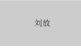
首先介紹文字的水平居中方法:
復(fù)制代碼 代碼如下:<div>劉放</div>
利用line-height設(shè)為height的一樣即可:
復(fù)制代碼 代碼如下:.wrap{
line-height: 200px;/*垂直居中關(guān)鍵*/
text-align:center;
height: 200px;
font-size: 36px;
background-color: #ccc;
}
效果如下:
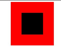
padding填充
利用padding和background-clip配合實現(xiàn)div的水平垂直居中:
復(fù)制代碼 代碼如下:<div>
<div></div>
</div>
通過backgroun-clip設(shè)置為content-box,將背景裁剪到內(nèi)容區(qū)外沿,再利用padding設(shè)為外div減去內(nèi)div的差的一半,來實現(xiàn):
.parent{ margin:0 auto; width:200px; height:200px; background-color:red;}.children { width: 100px; height: 100px; padding: 50px; background-color: black; background-clip:content-box;/*居中的關(guān)鍵*/效果如下:
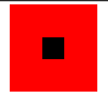
margin填充
接下來介紹margin填充的方式來實現(xiàn)水平垂直居中。
首先我們還是定義父子div:
<div>
<div></div>
</div>
這里我們利用將子div的margin-top設(shè)置為父div高度減去子div高度的一半,然后再通過overflow設(shè)置為hidden來觸發(fā)父div的BFC,LESS代碼如下:
@parentWidth:200px;@childrenWidth:50px;.parent { margin:0 auto; height:@parentWidth; width:@parentWidth; background: red; overflow:hidden;/*觸發(fā)BFC*/}.children { height:@childrenWidth; width:@childrenWidth; margin-left:auto; margin-right:auto; margin-top: (@parentWidth - @childrenWidth) / 2; background:black;}最后得到居中效果如下:

absolute定位
利用position:absolute搭配top,left 50%,再將margin設(shè)為負值也可以對div進行水平垂直居中,首先還是需要定義父子div:
復(fù)制代碼 代碼如下:<div>
<div></div>
</div>
然后設(shè)置相應(yīng)的css:
.parent { position:relative; margin:0 auto; width:200px; height:200px; background-color:red;}.children { position:absolute; left:50%; top:50%; margin:-25px 0 0 -25px ; height:50px; width:50px; background-color: black;}其中的margin中的值為該div寬度的一半,最后效果圖:
text-align居中
眾所周知,text-align可以使得一個div中的內(nèi)容水平居中。但是如果是要將該div中的子div居中呢?可以將子div的display設(shè)為inline-block。
.parent { text-align:center; margin:0 auto; width:200px; height:200px; background:red;}.children { positiona;absolute; margin-top:75px; width:50px; height:50px; background: black; display:inline-block;/*使其父元素text-align生效*/}圖片居中
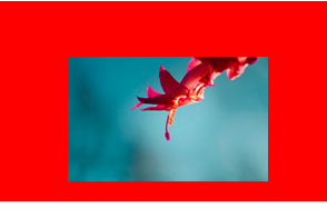
一般的圖片居中都是和text-align一樣,將圖片包裝在一個div中,將該div的text-align設(shè)為center即可。
可以參考下面的鏈接:
個人站點
有一種特殊的方式,利用了一個圖片進行占位,以讓父容器獲得高寬,從而讓進行-50%偏移的圖片能有一個參照容器作百分比計算。優(yōu)點是可以不知道圖片的大小,隨便放張尺寸不超過父容器的圖片上去都能做到居中。另外,兼容性好,IE6都是能順利兼容的。代碼如下:
復(fù)制代碼 代碼如下:<div>
<p>
<img src="http://nec.netease.com/img/s/1.jpg" />
<img src="http://nec.netease.com/img/s/1.jpg" /></p>
</div>
.parent { position:relative; width:100%; height:200px; background:red;}p { position:absolute; top:50%; left:50%;}.hidden-img { visibility:hidden;}.show-img { position:absolute; right:50%; bottom:50%;}效果如下:
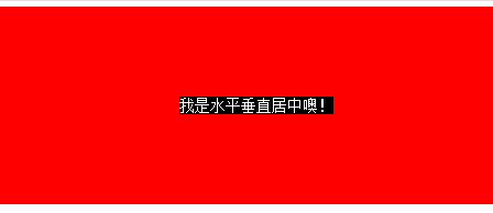
transform居中
上面講到的div居中的例子中,div的寬度都是固定的,然而實際項目中,有可能遇到不定寬的div,特別是響應(yīng)式或者移動端的設(shè)計中,更加常見。所以下面介紹一種不需要定寬的div水平垂直居中方法。
先上代碼:
復(fù)制代碼 代碼如下:<div>
<div>
<div>我是水平垂直居中噢!</div>
</div>
</div>
.parent { float: left; width: 100%; height: 200px; background-color: red;}.children { float:left; position:relative; top:50%; left:50%;}.children-inline { position: relative; left: -50%; -webkit-transform : translate3d(0, -50%, 0); transform : translate3d(0, -50%, 0); background-color: black; color:white;}效果如下:
首先我們利用float,將需要居中的div的父div也就是children的寬度收縮,然后left:50%,將children的左邊與水平中線對齊。這個時候,還沒有真正居中,我們需要將children-inner左移動-50%,這樣就水平居中了。
再來說說垂直方向,先將children的top設(shè)為50%,然后其上邊和垂直中線對齊了,同樣,我們需要將children-inner上移動-50%。但是這個50%是計算不出來的,所以我們用到了transform : translate3d(0, -50%, 0);
這個方法非常好用噢。
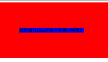
flex居中
最后來介紹一下CSS3中的display:flex來實現(xiàn)的水平垂直居中的方法。
復(fù)制代碼 代碼如下:<div>
<div>我是通過flex的水平垂直居中噢!</div>
</div>
html,body{ width: 100%; height: 200px;}.parent { display:flex; align-items: center;/*垂直居中*/ justify-content: center;/*水平居中*/ width:100%; height:100%; background-color:red;}.children { background-color:blue;}效果如下:
這種方式最為簡便,就是兼容性不好,不過隨著時間的前進,各大瀏覽器一定會都兼容的。
以上就是本文的全部內(nèi)容,希望大家可以喜歡。
相關(guān)文章:
 網(wǎng)公網(wǎng)安備