Django顯示可視化圖表的實(shí)踐
1 Django_laburls.py
# -*- coding: utf-8 -*- from django.conf.urls import url,includefrom django.contrib import admin urlpatterns = [ url(r’^admin/’, admin.site.urls), # 定義圖表url url(r’^chart/’, include(’chart.urls’)),]
2 在settings.py中添加圖表應(yīng)用
INSTALLED_APPS = [ ’django.contrib.admin’, ’django.contrib.auth’, ’django.contrib.contenttypes’, ’django.contrib.sessions’, ’django.contrib.messages’, ’django.contrib.staticfiles’, # 圖表應(yīng)用 ’chart’,]
3 charturls.py
# -*- coding: utf-8 -*-from django.conf.urls import url,includefrom . import viewsurlpatterns = [ # 折線圖的url url(r’^linediagram/$’, views.showlinediagram),]
4 views.py
# -*- coding: utf-8 -*-from django.shortcuts import renderfrom django.http import HttpResponse from matplotlib.figure import Figurefrom matplotlib.backends.backend_agg import FigureCanvasAggfrom matplotlib.dates import DateFormatterimport matplotlib.pyplot as plt import randomimport datetime # 折線圖對應(yīng)的的模板def showlinediagram(request): return render(request, ’chart/showlinediagram.html’)
5 模板showlinediagram.html
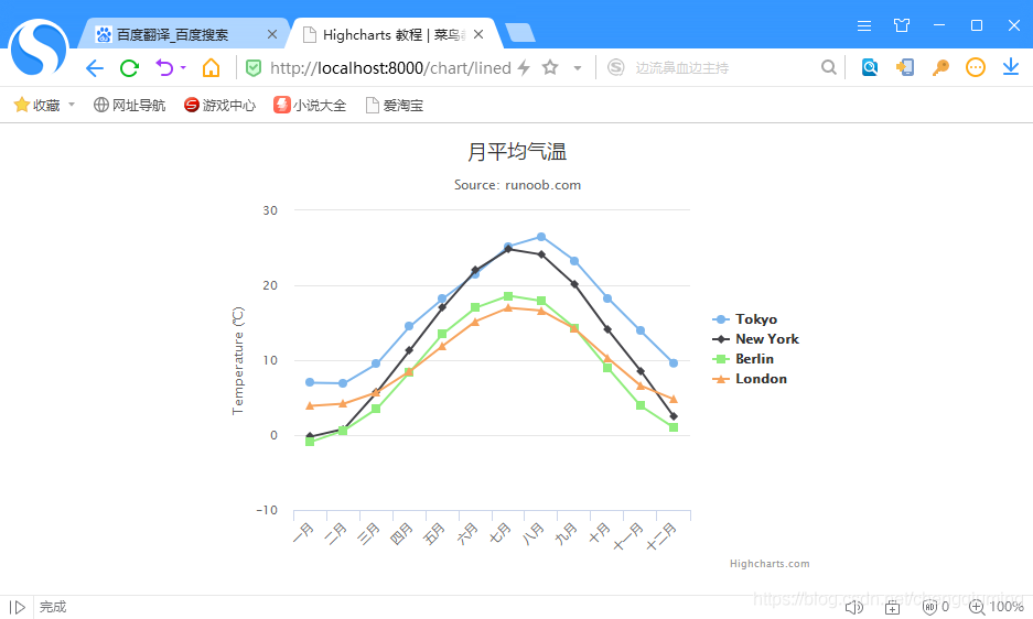
<html><head><meta charset='UTF-8' /><title>Highcharts 教程 | 菜鳥教程(runoob.com)</title><script src='http://apps.bdimg.com/libs/jquery/2.1.4/jquery.min.js'></script><script src='http://code.highcharts.com/highcharts.js'></script></head><body><div style='width: 550px; height: 400px; margin: 0 auto'></div><script language='JavaScript'>$(document).ready(function() { var title = { text: ’月平均氣溫’ }; var subtitle = {text: ’Source: runoob.com’ }; var xAxis = { categories: [’一月’, ’二月’, ’三月’, ’四月’, ’五月’, ’六月’ ,’七月’, ’八月’, ’九月’, ’十月’, ’十一月’, ’十二月’] }; var yAxis = { title: { text: ’Temperature (xB0C)’ }, plotLines: [{ value: 0, width: 1, color: ’#808080’ }] }; var tooltip = { valueSuffix: ’xB0C’ } var legend = { layout: ’vertical’, align: ’right’, verticalAlign: ’middle’, borderWidth: 0 }; var series = [ { name: ’Tokyo’, data: [7.0, 6.9, 9.5, 14.5, 18.2, 21.5, 25.2, 26.5, 23.3, 18.3, 13.9, 9.6] }, { name: ’New York’, data: [-0.2, 0.8, 5.7, 11.3, 17.0, 22.0, 24.8, 24.1, 20.1, 14.1, 8.6, 2.5] }, { name: ’Berlin’, data: [-0.9, 0.6, 3.5, 8.4, 13.5, 17.0, 18.6, 17.9, 14.3, 9.0, 3.9, 1.0] }, { name: ’London’, data: [3.9, 4.2, 5.7, 8.5, 11.9, 15.2, 17.0, 16.6, 14.2, 10.3, 6.6, 4.8] } ]; var json = {}; json.title = title; json.subtitle = subtitle; json.xAxis = xAxis; json.yAxis = yAxis; json.tooltip = tooltip; json.legend = legend; json.series = series; $(’#container’).highcharts(json);});</script></body></html>二 測試結(jié)果
1 瀏覽器輸入:http://localhost:8000/chart/linediagram
2 結(jié)果顯示結(jié)果
https://blog.csdn.net/Temanm/article/details/54141759
https://my.oschina.net/jastme/blog/357142
https://www.hcharts.cn/demo/highcharts/
http://www.runoob.com/highcharts/highcharts-configuration-syntax.html
到此這篇關(guān)于Django顯示可視化圖表的實(shí)踐的文章就介紹到這了,更多相關(guān)Django 可視化圖表內(nèi)容請搜索好吧啦網(wǎng)以前的文章或繼續(xù)瀏覽下面的相關(guān)文章希望大家以后多多支持好吧啦網(wǎng)!
相關(guān)文章:
1. nodejs報digital envelope routines::unsupported錯誤的最新解決方法2. 匹配模式 - XSL教程 - 43. javascript xml xsl取值及數(shù)據(jù)修改第1/2頁4. 詳解JS前端使用迭代器和生成器原理及示例5. WML語法大全與相關(guān)介紹第1/3頁6. 詳解CSS偽元素的妙用單標(biāo)簽之美7. 使用css實(shí)現(xiàn)全兼容tooltip提示框8. asp中response.write("中文")或者js中文亂碼問題9. ASP刪除img標(biāo)簽的style屬性只保留src的正則函數(shù)10. ASP 信息提示函數(shù)并作返回或者轉(zhuǎn)向

 網(wǎng)公網(wǎng)安備