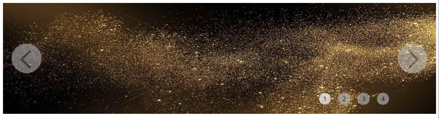
原生JS利用transform實現banner的無限滾動示例代碼
功能
原理
首先說下原理。
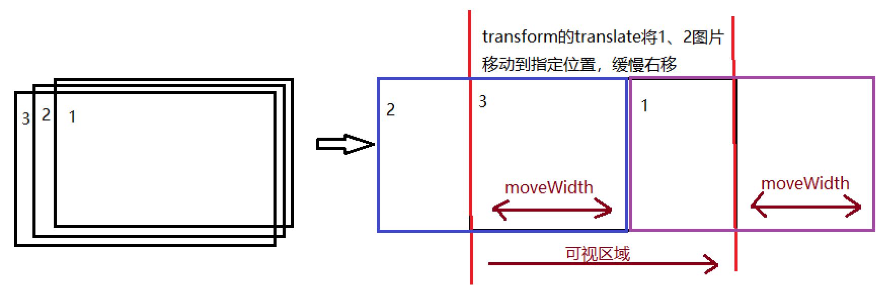
在布局上所有的圖片都是重疊的,即只要保證Y方向對齊即可,當前可見的圖z-index層級最高。 每隔3s中更換一張圖片,使用setTimeout定時。 使用gIndex記錄當前可視區(qū)域的展示的是哪張圖片下標,每次更換,計算下一張圖片的下標。 通過requestAnimationFrame實現一次圖片切換的動畫。這種方法也可以做到整個頁面始終只有2個img標簽,而不必把所有的img節(jié)點全部創(chuàng)建出來,要點是每次更換不可見img的src。
動畫的實現
首先定義一個timestap,這個值記錄每個幀移動多少距離。定義初始step=0,記錄移動的步數。 每次移動的距離moveWidth是timestamp*step,圖片1向右移動增加moveWidth,圖片2從左側進入moveWidth。因此,圖片1的transform是translate(moveWidth), 而圖片2的transform則是translate(moveWidth-圖片寬度)。 step+1 如果moveWidth>圖片寬度,步驟5,否則requestAnimationFrame請求下一次執(zhí)行,繼續(xù)2-4. 圖片1和2都將位置放置在起始位置,圖片2的z-index設置為最高。這樣就完成了一次移動的動畫。
html代碼
<header> <div class='box'> <img src='http://www.cgvv.com.cn/bcjs/imgs/banner1.jpg'> <img src='http://www.cgvv.com.cn/bcjs/imgs/banner2.jpg'> <img src='http://www.cgvv.com.cn/bcjs/imgs/banner3.jpg'> <img src='http://www.cgvv.com.cn/bcjs/imgs/banner4.jpg'> </div> <div class='buttons'> <div class='active'>1</div> <div>2</div> <div>3</div> <div>4</div> </div> <div class='left'> <div class='arrow'></div> </div> <div class='right'> <div class='arrow'></div> </div></header>
JS代碼
var timeout = null;window.onload = function () { var oLeft = document.querySelector(’.left’); var oRight = document.querySelector(’.right’); var oButton = document.querySelector(’.buttons’); var oButtons = document.querySelectorAll(’.buttons div’); var oImgs = document.querySelectorAll(’.box img’); var imgWidth = oImgs[0].width; var gIndex = 0; begainAnimate(); // 綁定左右點擊事件 oLeft.onclick = function () { clearTimeout(timeout); leftMove(); begainAnimate(); }; oRight.onclick = function () { clearTimeout(timeout); rightMove(); begainAnimate(); }; // 綁定數字序號事件 oButton.onclick = function (event) { clearTimeout(timeout); var targetEl = event.target; var nextIndex = (+targetEl.innerText) - 1; console.log(nextIndex); rightMove(nextIndex); begainAnimate(); } // 默認初始動畫朝右邊 function begainAnimate() { clearTimeout(timeout); timeout = setTimeout(function () { rightMove(); begainAnimate(); }, 3000); } // 向左移動動畫 function leftMove() { var nextIndex = (gIndex - 1 < 0) ? oImgs.length - 1 : gIndex - 1; animateSteps(nextIndex, -50); } // 向右移動動畫 function rightMove(nextIndex) { if (nextIndex == undefined) { nextIndex = (gIndex + 1 >= oImgs.length) ? 0 : gIndex + 1; } animateSteps(nextIndex, 50); } // 一次動畫 function animateSteps(nextIndex, timestamp) { var currentImg = oImgs[gIndex]; var nextImg = oImgs[nextIndex]; nextImg.style.zIndex = 10; var step = 0; requestAnimationFrame(goStep); // 走一幀的動畫,移動timestamp function goStep() { var moveWidth = timestamp * step++; if (Math.abs(moveWidth) < imgWidth) {currentImg.style.transform = `translate(${moveWidth}px)`;nextImg.style.transform = `translate(${moveWidth > 0 ? (moveWidth - imgWidth) : (imgWidth + moveWidth)}px)`;requestAnimationFrame(goStep); } else {currentImg.style.zIndex = 1;currentImg.style.transform = `translate(0px)`;nextImg.style.transform = `translate(0px)`;oButtons[gIndex].setAttribute(’class’, ’’);oButtons[nextIndex].setAttribute(’class’, ’active’);gIndex = nextIndex; } } }}window.onclose = function () { clearTimeout(timeout);}
css布局樣式
<style> /* 首先設置圖片box的區(qū)域,將圖片重疊在一起 */ header { width: 100%; position: relative; overflow: hidden; } .box { width: 100%; height: 300px; } .box img { width: 100%; height: 100%; position: absolute; transform: translateX(0); z-index: 1; } .box img:first-child { z-index: 10; } /* 數字序列按鈕 */ .buttons { position: absolute; right: 10%; bottom: 5%; display: flex; z-index: 100; } .buttons div { width: 30px; height: 30px; background-color: #aaa; border: 1px solid #aaa; text-align: center; margin: 10px; cursor: pointer; opacity: .7; border-radius: 15px; line-height: 30px; } .buttons div.active { background-color: white; } /* 左右切換按鈕 */ .left, .right { position: absolute; width: 80px; height: 80px; background-color: #ccc; z-index: 100; top: 110px; border-radius: 40px; opacity: .5; cursor: pointer; } .left { left: 2%; } .right { right: 2%; } .left .arrow { width: 30px; height: 30px; border-left: solid 5px #666; border-top: solid 5px #666; transform: translate(-5px, 25px) rotate(-45deg) translate(25px, 25px); } .right .arrow { width: 30px; height: 30px; border-left: solid 5px #666; border-top: solid 5px #666; transform: translate(50px, 25px) rotate(135deg) translate(25px, 25px); }</style>
到此這篇關于原生JS利用transform實現banner的無限滾動示例代碼的文章就介紹到這了,更多相關JS banner無限滾動內容請搜索好吧啦網以前的文章或繼續(xù)瀏覽下面的相關文章希望大家以后多多支持好吧啦網!
相關文章:
 網公網安備
網公網安備